
The dress and the colour palette are the two decisions that show most in your photographs, and the ones that last longest. This is a guide to what is coming in 2027, with what I have learned about how each looks in front of the camera.
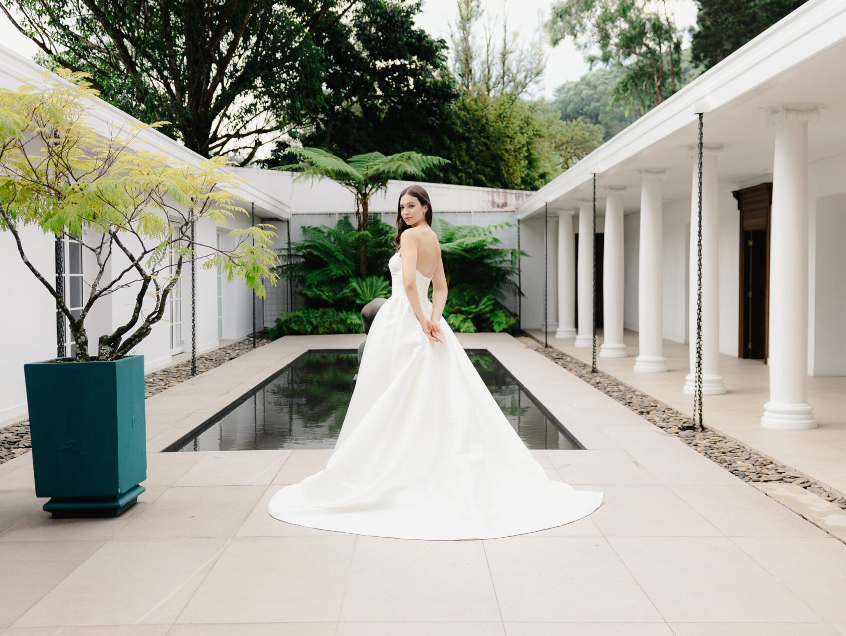
The silhouettes of 2027
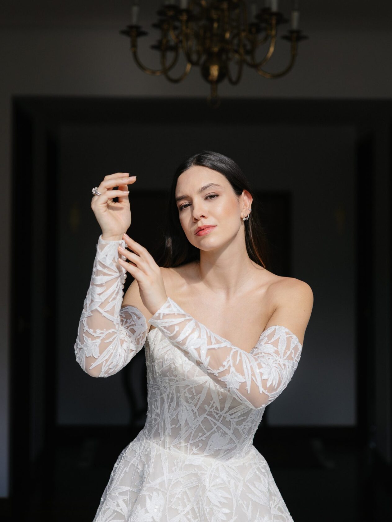
The spring 2027 collections revolve around three shapes: the halter neckline, the dropped or basque waist, and straight dresses that open at the hem. I covered them in more detail in what the runways and Vogue showed. If your wedding is during the day and somewhere warm, a halter and fluid fabrics are a safe choice. At night, in a church or a ballroom, the structure of a defined waist shines.
Fabrics that move
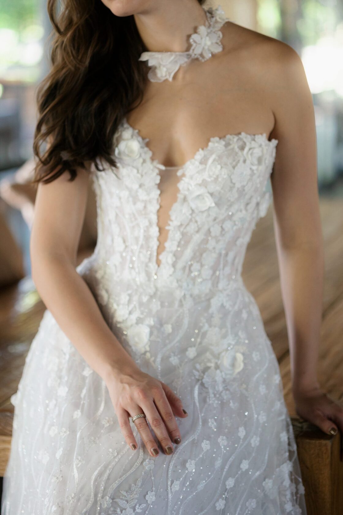
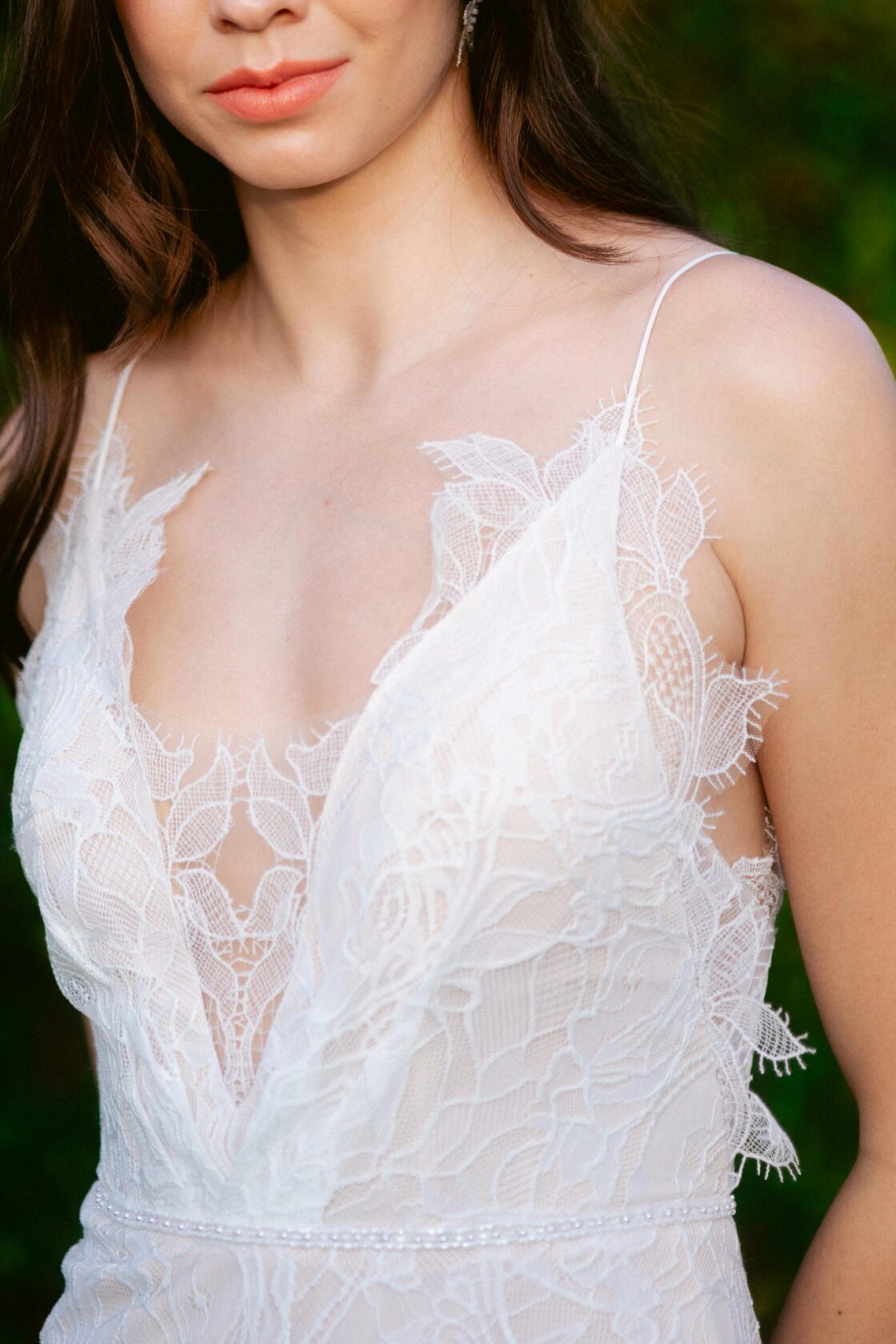
Silk, crepe, chiffon and soft lace over sheer layers. Fabrics with drape look best in motion, and wedding photographs today are full of motion: walking, turning, dancing. Very stiff fabrics, or ones with a plastic shine, can look harsh under party flash.
The colour of the dress
Optical white is giving way to warmer tones. The ones brides are choosing most, according to boutiques and designers:
- Ivory and off-white, which soften the skin.
- Champagne and beige, beautiful in golden sunset light.
- Pale pink and blush, like Jaclyn Whyte’s pink lace for spring 2027.
- Pale blue and pearl grey, for a colour that is barely there.
- Black, gaining ground for the party or for evening weddings.
A photographer’s tip: if you are torn between two whites, try them in natural light, next to a window. Boutique lighting is deceiving.

The wedding palettes
For decor, flowers and bridesmaids, 2027 is heading in two directions:
- Soft tones: powder pink, baby blue and lilac, like Tanner Fletcher’s spring 2027 collection. They work beautifully in gardens and open shade.
- Deep tones: crimson, blood orange and wine, seen in recent collections from Monique Lhuillier, Galia Lahav and KYHA. Under tropical light they look vibrant.
- Blues in several shades, which planners in Italy and France recommend for warm Mediterranean light.
- White on white, in the spirit of Cloud Dancer, Pantone’s 2026 colour. The 2027 colour is announced in December.
Bridesmaids in one colour family
Fewer identical dresses. What we see most is a palette of three or four close tones, with each bridesmaid choosing her own cut. In group photographs it looks harmonious and natural.
How colours look in photographs
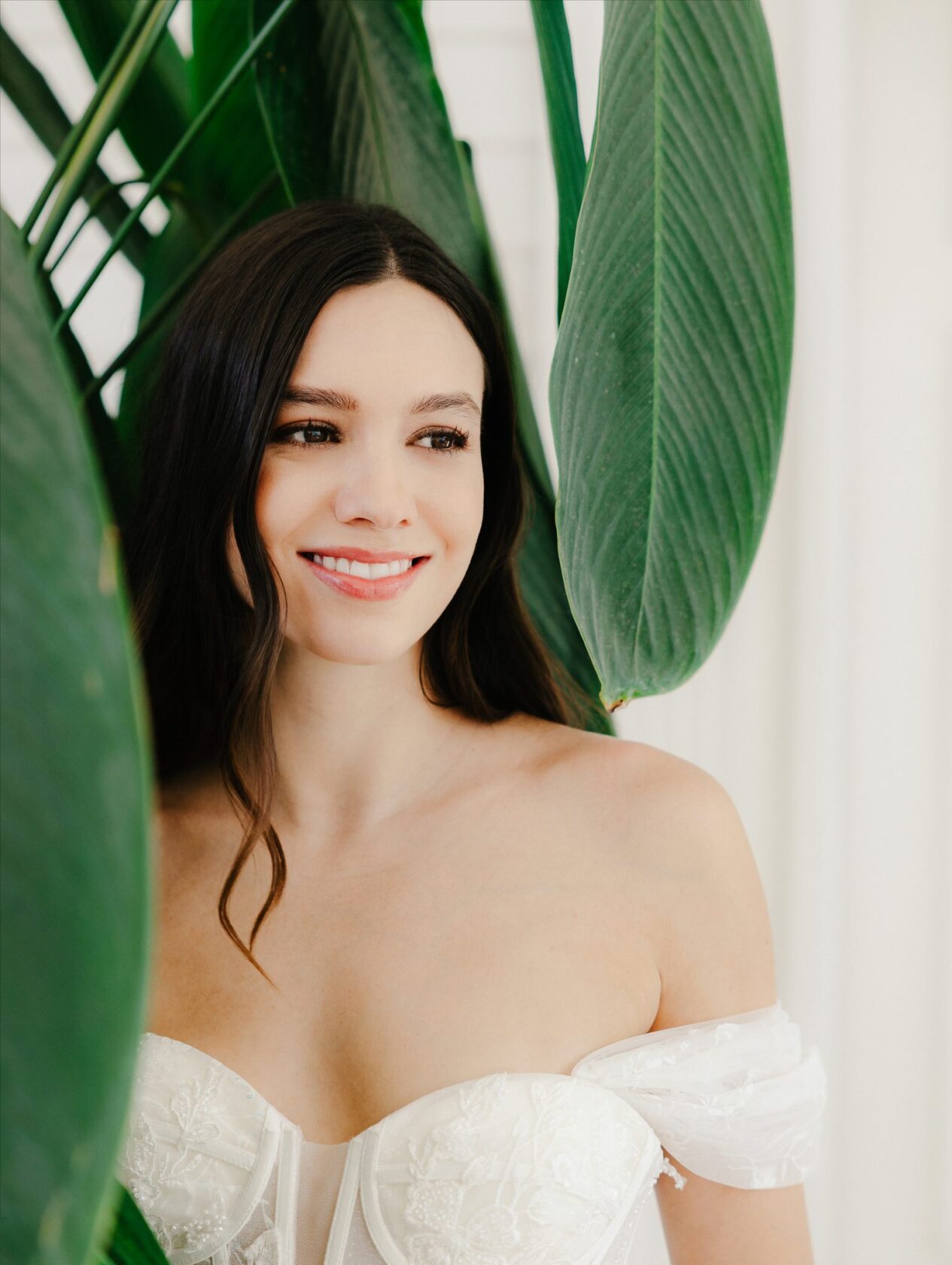
- Choose the palette for the light of the place. In Cartagena the light is warm and strong; in Medellín and Llanogrande there is a lot of green, which reflects onto skin.
- Very saturated reds and oranges can tint the skin when they sit close to the face.
- If you love black and white photographs, look for contrast between the dress, the suit and the flowers.
- Avoid neon: it almost never ages well.
A note on fashion
Trends change every season, but photographs are looked at for decades. My advice is to choose what makes you feel like yourself, and use the trend as inspiration, not as a rule.
Sources
Want your palette to work in photographs? Write to me and we can look at it together before the wedding.


